A few months ago I was in a premier visitor attraction shop (as I often am!) and noticed that despite exiting through the gift shop visitors were tending to drift through the shop and leave without a purchase.
Why?
Often the difference between whether one purchases or not in a museum shop comes down to one powerful factor – Visual Merchandising. I love this quote from Michael Guajardo (Virginia Museum of Fine Arts)…
Visual merchandising is the silent sales team that is always working to impact the bottom line…is always on the clock, and never takes breaks
Good visual merchandising will boost your conversion rate, your average transaction value and even attract visitors to your shop on a stand-alone basis. Here are my top tips for using it successfully!
- Get them in
If like a lot of us you aren’t lucky enough to have visitors exit through the gift shop – it is absolutely essential to catch the eye of the customer on the way past. Use your shop windows creatively to draw customers in and make sure the displays at the front of the shop reflect current exhibitions or seasonality to tempt them to come in for a look. If you are lucky enough to have exit through the gift shop wow them with displays to make sure they stay and purchase.
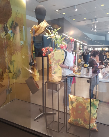
- Know what you are selling – and who you are selling to!
It’s really important to know who your customers are and reflect this in your visual merchandising. Nowhere is this more important than in your shop layout. In National Museums NI, all our shop spaces need to offer products for both children and adults. In order to manage this the shop floor is clearly zoned so customers can find ‘their’ area with colour and signage. No one wants to try on expensive jewellery with bouncy balls whizzing past their ears! Products and visual displays are targeted to the target market. A display to attract children is very different than one for adults!
- Make sure your customer knows too!
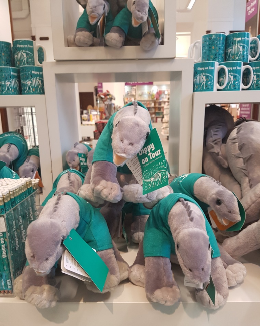
I am obsessed with clean lines on our displays and have clear rules on merchandise positioning. A customer should be able to go to any area of a shop and understand the merchandise immediately. What is the story you are telling? It could be Dippy, Irish Art, Local History but it should be crystal clear to the customer.
Displays which are fussy and aren’t thought through can actually be detrimental to sales. If the customer doesn’t understand what an area or display is telling / selling they get confused and drift off bemused by too much ‘stuff’. As a buyer I don’t purchase anything if I don’t know exactly where that product will go in the shop and what story it will fit into.
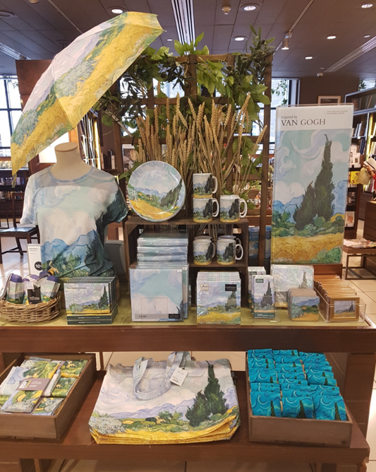
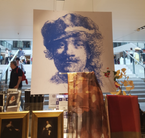
Below is a fantastic example of a clean, clear story telling display – one glance tells the customer everything. This display says if you love this painting here is the place to shop!
- How to create beautiful displays
An unusual or lovely display can stop customers in their tracks. When building a display start with the core pieces those you need / want to sell – it could be a catalogue or some key exhibition merchandise. Then layer in complementary product such as more generalist books on the topic. Items in a display should be clearly related to the main products.
Create eye appeal by using focal points to add height or creating pyramid displays. I always step away a few times while building the display and come back to review – is it too busy? Does it feel unbalanced? Often the key is to simplify rather than try to throw too much into the mix. Products should be able to ‘breathe’ within the display and not feel cramped and squashed. If you are selling high end products in a display it is crucial to build in space around them to convey the special nature of the product and suggest luxury and value. Add striking accessories or specialist fittings to add drama and interest.
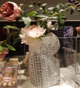
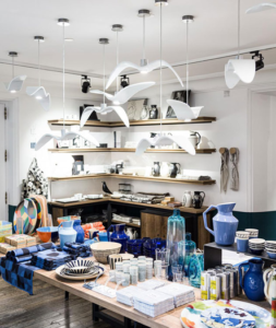
Where you are selling a disparate collection of items – for example assorted ceramics or homeware – use colour palettes to bring them together. Always bear in mind the purpose of the display is to sell. Displays should be easy to access and feel ‘shopable’– the customer doesn’t want to feel afraid to touch or reach for products.
- Adding height
- Using Colour to tie the display together
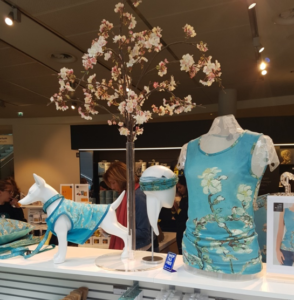
- Add striking accessories
- Use your suppliers
The suppliers who provide artisan jewellery or handmade ceramics to your museum are talented, design led people. Why not use this to get them to come in and merchandise their product for you? They often use props and materials which reflect their own unique vision and help to create special and memorable displays. The supplier below uses etchings, paintings and antique look drawing books to create a unique look. Its a win / win for the museum shop and for their brand!
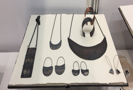
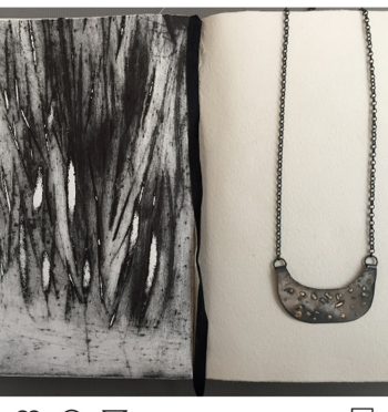
- Use clear point of sale to highlight the ‘special’ nature of local or hand made products and their provenance
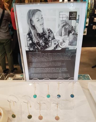
- Don’t forget to grab an extra sale
Once you have the customers at the till point why not try to motivate an additional impulse purchase? Provide another chance to buy exhibition catalogues, or motivate an impulse add-on buy with items such as beautiful bookmarks or striking wrapping paper.
“We’ve done surveys and about a third of the people who come to the museum say that they plan to shop here,“ Rich Perdott, the Met’s vice president of merchandising, told the New York Times.
“They’ve said they want to buy something that’s a tangible memory of their visit. Part of our goal always is to give them something they couldn’t get elsewhere.“
So remember the visitors are already onsite and motivated to purchase – don’t let the opportunity slip through your fingers!
Want to know more?
This FREE micro-course will give you the tools to use the theatre and drama of visual merchandising to best effect in your shop.
Our Visual Merchandising Masterclass, led by Ruth Aldous-Taylor, Head of Retail Visual Identity at the National Trust, is coming to the Geffrye Museum in November.
You can also hear Catherine discuss how to be a better buyer on the Cultural Enterprises Podcast.
Thanks for crediting the National Gallery and using an image of one of our shops. All our Visual Merchandising is designed and produced in-house by the amazing Matilda Downs.
Hi Douglas- my pleasure – Matilda is a very talented lady! All the displays were just fab!