A couple of months ago I was invited to work on a project between the Association for Cultural Enterprises and Rural Arts, a charity that provides inspiring and inclusive creative opportunities across North Yorkshire. Part of their offer is a community arts centre in a Grade II listed former Courthouse in the small market town of Thirsk. The arts centre hosts a programme of workshops, performances, exhibitions and events alongside a café, gallery shop and room hire. The team at Rural Arts are keen to transform their current ‘gallery shop’ into a more profitable operation in support of their extensive arts programme. Of course, I was delighted to accept the offer – and not just because I was asked to ‘do a bit of a Mary Portas’, which is essentially my dream job.
Having had my hair cut into a sharp bob, I was excited to make an initial visit and meet the team in person. My first impressions of Rural Arts were that Director and CEO Max and Operations Manager Angela are passionate about the work that they do and are two of the most hardworking people I’ve ever met. I was exhausted just listening to their vast to-do list! The award-winning café is a lovely, welcoming space that is clearly valued by the local community, and the programme (and frequency) of events is seriously impressive. Within this context it is clear that the shop is struggling to reach its potential, understandably dropping down that endless list of priorities. It’s a common pattern that I’m sure lots of similar organisations will recognise…
…the shop isn’t very profitable so we can’t afford to spend much time on it /
because we don’t spend much time on it, the shop isn’t very profitable…
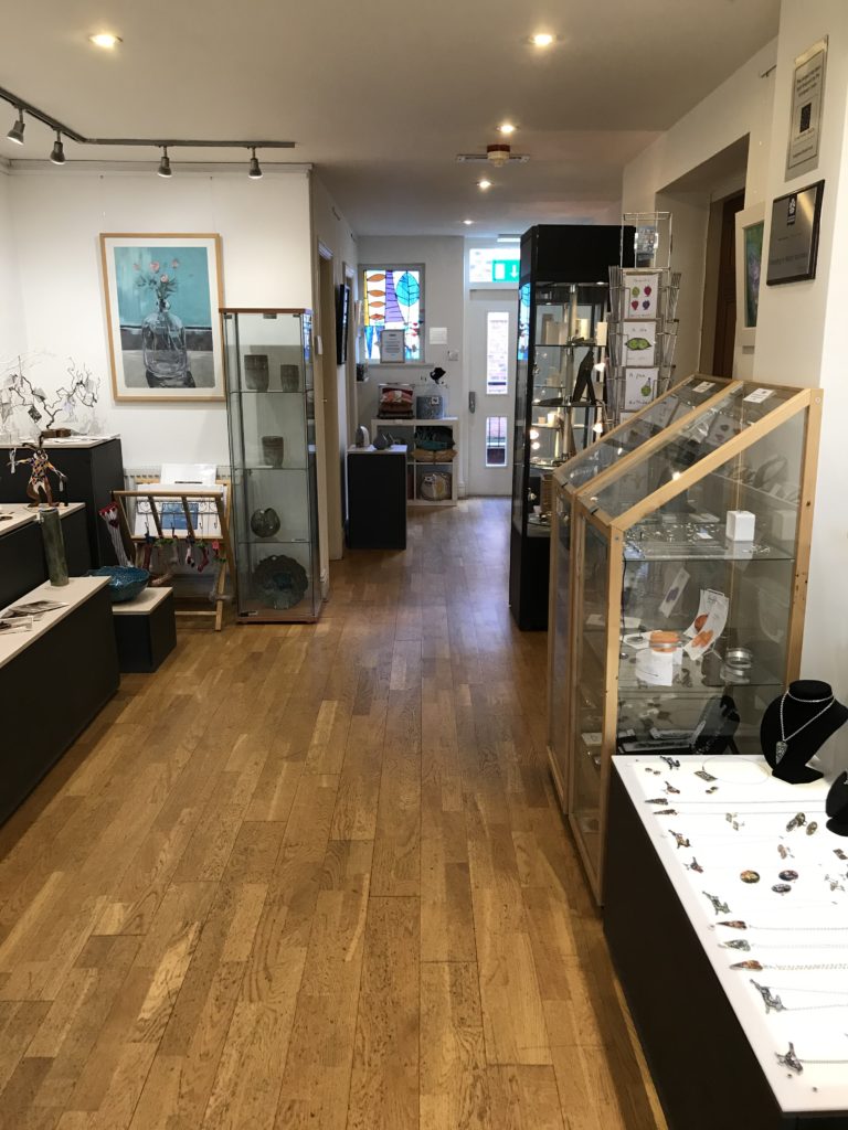
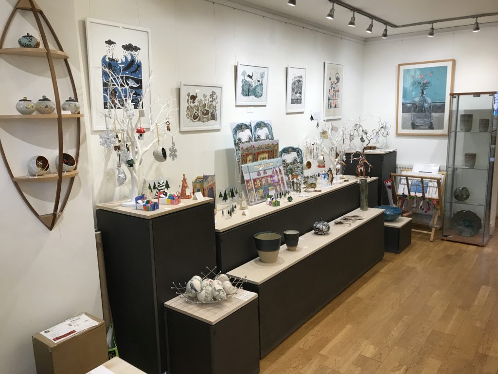
That’s not to say it’s not a good shop, because it definitely is. Angela has bought in some lovely Christmas products to supplement their existing range of artist-wares. The offer is a mix of jewellery, ceramics and homewares, which are merchandised with the feel of an art gallery. However, the stock density is light, and at the front of the shop, which is excellently positioned right by the main entrance, is a pretty hefty information desk. The shop also serves as the only route to the building’s bathrooms, which is a challenge I certainly haven’t encountered before!
There are evidently some difficulties to overcome within the space, but there is also huge potential and I definitely feel like there are some easy but productive changes that can be made. Walking around the shop I could see lots of opportunities to develop a more commercial space by implementing some retail best-practice:
Product Displays:
- Delicate decorations were beautifully displayed on a jewellery tree. While this looks appealing, it’s important to be aware that customers may be hesitant to touch stock that appears to be part of a display, or if they think they might break something! Having packaged stock next to the lovely display is an easy solution to this.
- Jewellery is clearly an important category for Rural Arts, but most of it was under glass despite having relatively low retail prices. Customers can feel reluctant to ask to see items – so unless it really needs to be protected, it is best that customers can touch the products or even try them on with a mirror. Being able to feel an item also significantly increases the likelihood that they will purchase.
- Although the existing artist-wares are appealing, the focus on a ‘sale or return’ approach to stock means that a) the product range is very narrow, and b) margins are low because of the commission-based sales structure, which can be a barrier to becoming more profitable.
- Having a good mix of product categories, price points and designs/themes means the shop will appeal to a wider audience, and ranges can be tailored to particular customer groups, which will only increase sales and profit
Fixtures and Layout:
- The information desk is right at the front and obviously fulfils an important function (it’s also where the shop till is), but in this narrow space it is acting as a physical barrier. Ideally, the front of the shop should be a selling hot spot, beautifully merchandised to draw as many people as possible into the space.
- Understandably for a small charity, there has been little investment in the shop fixtures and fittings so the space would definitely benefit from a fresh look. Customers are more likely to spend, and spend more, in a shop that looks and feels more premium.
Operations:
- Staffing demands pose issues, meaning the shop is not always staffed and customers are served by members of the café team. This can be a challenge, especially as many of the products are artist-made and are sold by their provenance. Having some attractive and informative signage will really help with customer engagement and will add significant value to the displays.

Having visited Rural Arts in person, I’m now even more excited to get started on this project properly. With all the challenges and opportunities in mind, I’ll be working with the team to create a new store layout, change the approach to buying and merchandising, design a visual merchandising scheme, and deliver some vital staff and volunteer training. I’ll also be writing blog post about each area along the way.
In my next post I’ll be looking at how to design a shop layout and make the best use of available space, as well as covering how we’re going to measure the success of the changes we’re making. Until then, I urge anyone passing near Thirsk to stop by Rural Arts – I can recommend the coffee and cake! And in the meantime, I’m off to have my hair dyed ginger…

Dear Alex,
Very excited to see the transformation!