Little prompts and nudges can make a world of difference when it comes to the online checkout experience. We call these words of encouragement microcopy.
Outside of the arts, product designers and UX writers know the value of microcopy to improve the user experience. And there are a few organisations setting good examples in the sector too. But I’d like to advocate for marketing and content people in the arts to take their microcopy further. Because a short bit of copy can go a really long way.
This short article will guide you through some definitions and microcopy approaches, and show you how getting this content right could ultimately increase your revenue.
What is microcopy?
Microcopy is words and short phrases that guide users through different actions and interactions on a digital product, like an app or a website. You might have encountered microcopy in the form of:
- Button text
- Confirmation messages
- Checkout messages
- Error messages
- Text fields in forms
- Loading copy
Microcopy isn’t just about helping and encouraging users to take action, it helps them to build trust with your digital products. Without a ticket confirmation message, how do I know if my purchase has actually gone through?
There are different approaches to writing microcopy. And success usually lies in mixing a few different approaches up. Let’s take a look at some of them.
The functional approach
The term microcopy was first coined in a 2009 blog by Joshua Porter. In the blog, Joshua describes how adding a few words to a checkout form on an interface he was building completely eliminated all the payment errors that occurred.
The 12 short words he added served a functional purpose, guiding users through the steps they needed to take to complete their task. The foundations of microcopy lie in this approach, and it’s probably what you’ll come across most often. The aim is to instruct, prompt or support users in the simplest way possible. No frills.
Take this newsletter confirmation message. It’s simple, practical and polite. And often that’s just what users need and expect. But lean on this approach too much and your brand personality could be at risk of vanishing into the background.

The conversational approach
The way we communicate with each other has shifted dramatically over the last 20 years. For most of us, the days of ‘Kind regards’ are over. The conversational style that was once limited to our personal lives has overspilled into our working lives. And with that, we’ve seen brands taking a more informal approach with their messaging.
In her book Conversational Design, Erika Hall advocates for using more human, colloquial and spoken language to elevate our experience with digital products.
The traditional categorization between the language of writing and the spoken language has collapsed, and a third option has emerged; conversational writing.
Spotify’s sign-up message is a great example of harnessing the nature of human communication. This could have easily turned into a dull, corporate marketing message (Get access to Spotify’s library of music for free. Sign up now). Instead, they opted for two punchy sentences that feel more like a familiar text message from a busy friend (Dinner at 7pm. Bring wine).

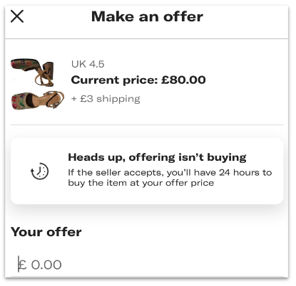
Fashion resale app Depop uses phrases like ‘Heads up’ to guide their users through key terms and conditions. Again, it’s punchy, casual and genuinely reflective of the language its audience uses.

The conversational approach is where I think the arts sector can benefit most. Using plain English, snappy sentences and more colloquial language would help to shake off the official air that many institutions unintentionally give off. There are a few nice examples already in the sector. Like this short encouraging checkout message from MoMA.

The playful approach
There are opportunities to use microcopy to inject humour, playfulness and moments of delight. Companies like Slack are known for sprinkling their products with microcopy that can take a user by surprise. Like this message that pops up when your inbox is empty. It’s random and makes no sense. But it has so obviously been written by a human on a mission to snap users out of their world for a split second of joy.

This approach should be used with caution. Executed without care and context, this style of microcopy can be inaccessible. But there are ways of pulling it off well.
Shakespeare’s Globe uses a clever bit of microcopy on their website navigation. It’s just two words to describe their online shop, but it’s brilliantly juxtaposed with all the ‘normal’ copy you expect from a navigation.

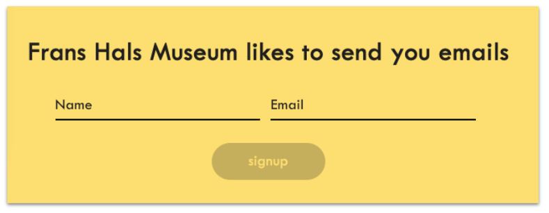
Likewise, the Frans Hals Museum newsletter sign-up copy is infused with lightness and humour. As someone reading this, I start to imagine a person or a character behind these words, instead of the usual indiscernible voice.

Guiding your users to checkout
There are opportunities to apply one or more of these microcopy approaches throughout your digital estate. But with pressure on arts and cultural organisations to bring in more revenue, the checkout journey could be a good place to start.
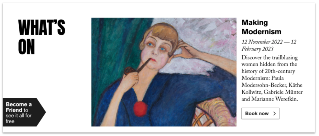
The Royal Academy uses subtle encouragement throughout the users’ consideration phase on their website. A prompt on the What’s On listings reminds users that they can see it all for free by becoming a member.

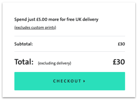
And at checkout in the V&A shop, a clever bit of microcopy nudges users to take advantage of free delivery by spending a little more.

How your website or digital product is built and the platforms you use for your purchase path will determine the flexibility you have to create or edit microcopy. You may be limited without the help of a developer and/or a designer. But it really is worth exploring.
5 tips to get started with microcopy
- #1 Start with the user. Microcopy is primarily there to serve a functional purpose. Take it beyond the functional and you’re attempting to build an emotional bond with your users. Think about what kind of emotional state your user might be in at the time of reading your microcopy.
- #2 Refer to your brand voice guidelines. Your microcopy needs to feel like it’s coming from the same voice as all your other copy. Don’t divert just for the sake of it. Or if you are diverting, it’s probably time to revisit your brand voice.
- #3 Make sure your microcopy is accessible. Your microcopy needs to work for people using screen readers, so be aware of visual cues that provide further context. Microcopy expert Kinneret Yifrah suggests closing your eyes and reading your copy out loud to make sure it’s clear.
- #4 Take inspiration from poetry. Creative microcopy can sometimes be a little bit poetic. It’s an attempt to capture a concept or experience (often abstract) in very few words. If you’re struggling to write microcopy, try writing poetry instead. UX content strategist Meridel Walkington has written an excellent blog about the parallels between writing microcopy and poetry. Worth a read.
- #5 Begin where you can. Even if you have full editing access in your CMS, there’ll be areas of microcopy on your website that you’ll probably need a developer to change. Start by actioning all the areas of the website you can edit. Then, test a few user journeys and explore where you can take it further.
Substrakt is a digital agency specialising in the arts and culture sector. If you have any questions about what you’ve read or would like some support with your microcopy, your content strategy or your wider digital activity, just drop us an email and we’ll be in touch!
