Giving your shop a fresh new look by updating your displays and reorganising units is a well-known and commonly used sales tactic in retail, regardless of sector. It can be a very effective and visual way of letting your customers know “hey, we’ve got some shiny new stuff to show you”. But sometimes it’s tricky to know the best way to approach designing a new layout, and there are lots of things to consider that all make a difference to the bottom line.
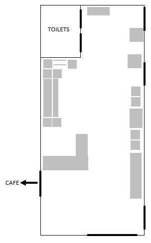
As I mentioned in my previous post, the team at Rural Arts have managed to create an appealing retail space from a part of the building that was never intended as such. Inevitably this means that there are some challenges to overcome in terms of the layout and visitor route – many of which will be all too familiar within the culture and heritage sector! But what are the main considerations, and how do you go about optimising your shop layout? These are some of the things we’ve been thinking about at Rural Arts:
Enticing the customer in
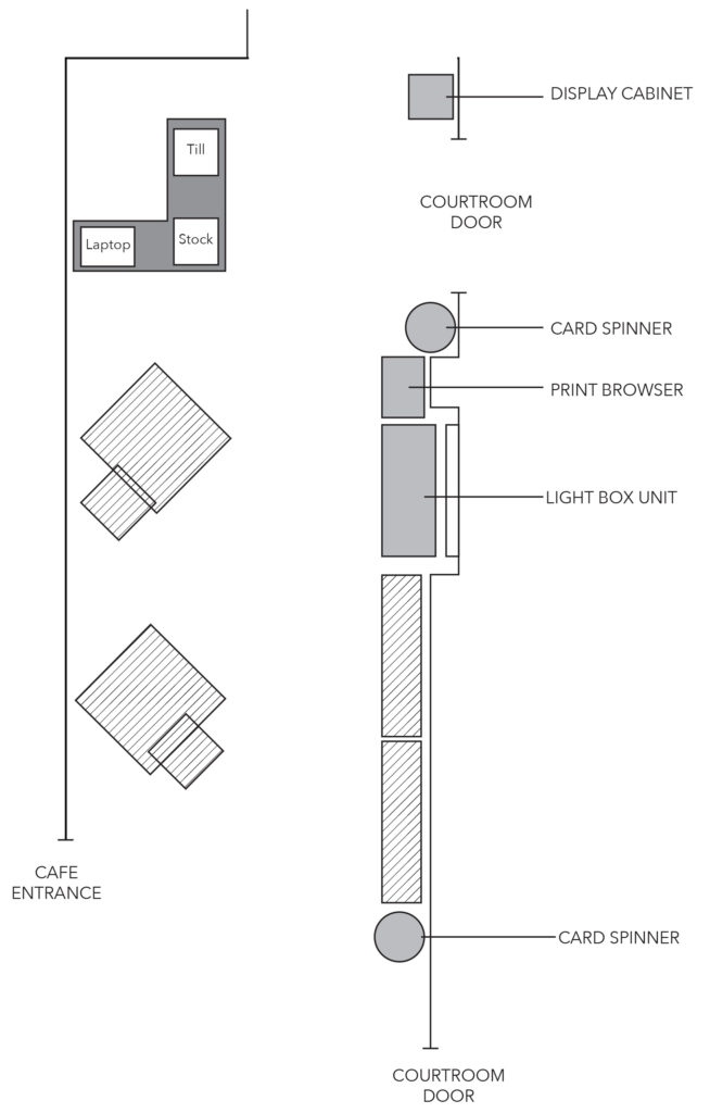
Bringing retail displays forwards and positioning your best-selling or most attractive ranges right at the front of the shop will immediately grab the attention of passing visitors – and once you’ve made that first impression, they are far more likely to keep looking. The shop at Rural Arts has an excellent location by the main entrance/exit to the building but situating the till at the front of this space has turned it into more of an information point than a retail point of sale. We have made the decision to move the desk further back into the shop to make way for a high impact display by the main entrance, with the added benefit that visitors looking for information must now enter the retail space in order to find it.
Sightlines
Maintaining sightlines with the careful placement of fixtures and product displays will ensure visitors can easily navigate their route – especially if the space is narrow or if you need to signpost a way through. With the till desk being relocated further back in the space, the displays in the Rural Arts’ shop will be positioned to ensure a clear sightline from the main entrance to the desk.
Journey of discovery
One way of encouraging potential customers to browse the whole shop is to consider your approach to visual merchandising. Using multi-height fixtures and risers and placing mid-floor fixtures in a staggered arrangement, rather than aligned, creates more interesting and engaging displays and customers will love the sense of discovery. In the Rural Arts’ shop, we will be creating multi-height mid-floor fixtures from different sized tables and sets of nesting risers as well as using shelving units with different shelf heights. This will give us a practical but visually interesting base on which to display the product ranges.
Go Zonal!
It’s best practice in big shops to have separate ‘zones’ for different ranges and customer types, and even if your shop is spatially challenged you can still benefit from a similar approach. It’s a good idea to think about who your products and ranges appeal to and locate similar themes alongside each other to encourage cross-selling and add-on purchases. The Rural Arts shop is fairly small, but we’ll be zoning the space by, for example, creating a print browsing zone at the rear of the shop and a jewellery and accessories zone with a mirror for customers to try products on.


Proposed floorplan
Finding a layout that works for customers and delivers commercial results will require a different approach in every shop, but as a final note I’d say it’s always worth trying something new. As long as you take the time to measure the performance – then you can always revert to the previous layout if your changes aren’t successful or just try something else! We’ve used a to-scale floorplan to propose what we believe will be an effective new design for the Rural Arts’ shop, and I look forward to reporting on its success, and any lessons learned, later in the year.

One Reply to “Rural Arts’ Retail: Designing a New Shop Layout”